


The giggle test for pricing and 3 ways to group information together
Plus a new procreate brush set I'm digging.

It’s been a crazy week (okay, two actually).
I took on my first sketchnote client work and then I found a new Procreate brush set (making me question everything). Then I found a Procreate feature that’s been a real productivity boost.
You can bet they’re all included in this week’s newsletter as well as a visual essay and tutorial on 3 ways to group information together in sketchnotes.
Enjoy!
Interesting Links
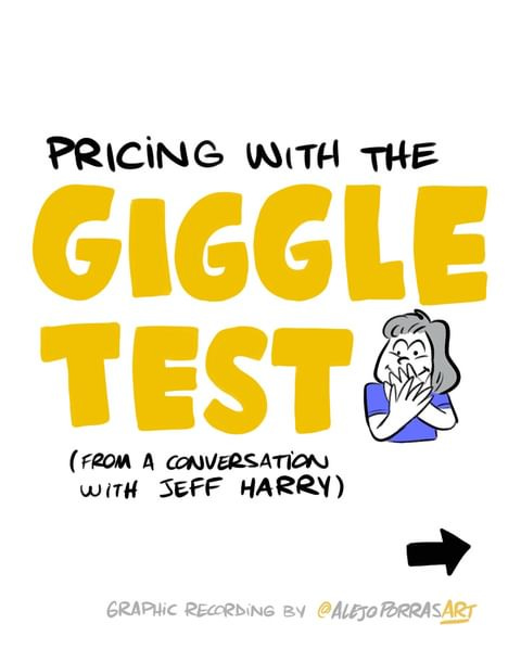
How should you set your pricing? Well, this carousel from Alejo Porras has some surprising advice that I’m taking a lot of notes on now I’m taking on client work.
Public safety warning: don’t put your wet iPhone in rice (do this instead)

Caroline Chappell, graphic recording pro, created a meaningful poster for her local surgery on their values. What a wonderful gift.

Want to use the BEST graphic recording and sketchnoting pens in Procreate? Now, you can (sort of). Neuland and Bikablo have teamed up to make a procreate brush set including Bikablo posters, Neuland brushes and colour pallets. I bought it and I love they’ve done a great job!
Did you know Procreate has a quick menu? I don’t think I had ever heard this but the Bikablo materials reminded me of it. Here’s how to set it up and use it.
Tutorial: 3 ways to group information together
What information belongs to what topic in a sketchnote?
If it’s too hard to work out, the reader might be confused and move on.
Luckily there are three easy tools for you to play with.
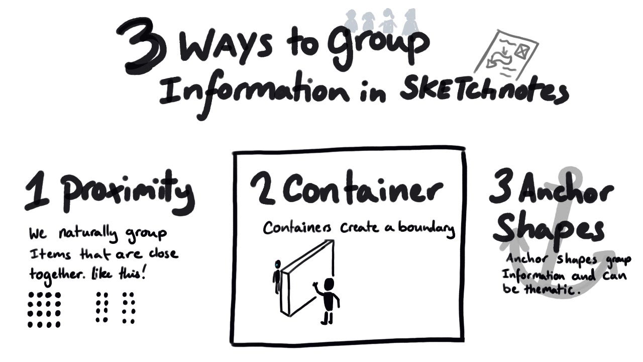
Proximity
We naturally assume things that are close together, belong together.
So if you have an icon next to some text, the reader will probably assume it’s related.
This can get tricky when you have a lot of information in one sketchnote. So you may want to try…
Using border and containers
A container groups items together.
A border shows the dividing line.
Both are clear expressions of what belongs to what, but they can make things feel blocked off. Not great when topics flow from one another. So maybe you’d like to try…
Anchor shapes
An anchor shape is a shape that goes behind a group of information.
It’s usually a muted background colour. It’s very easy to do in a digital app with layers, but you can do it with analogue notes too. Just use a lighter colour or make a shape to group things together.
The cost of being wrong is less than doing nothing - Seth Godin
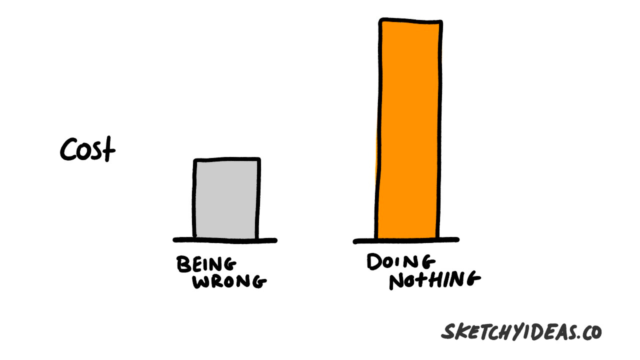
A good plan executed is better than a perfect one.
Why? Because the perfect one is never ready.
That doesn't mean you shouldn't sweat the details or do the best job you can — you should! Just don't overcomplicate things.
A simpler plan that is executed will win every time.
And when you've actioned a plan, you'll have firm data you can use to improve.
Anyone who wants to learn a skill has to start before they are ready. You can help yourself by practicing in private and ambiguity but stepping out of your comfort zone will bring great benefits too.
See you next week
A bit of a bigger newsletter after missing last week (I was travelling and then ill) but I hope you’ve found something great inside.
I certainly enjoyed creating it.
I hope to see you next week.
Chris
Congratulations on your first sketchnote client!
It is just the beginning. More work will certainly seek you out.